Designed Chaos
Building the visual identity for season two of Airbnb Design—Talks
It was a thrilling oxymoron of a brief. The ask? Design a system around the topic of chaos. When it came time to start strategizing the second season launch of Airbnb Design—Talks, When Chaos Is Your Creative Director, I was immediately ahead of myself. I was mapping out an Illustrator artboard for the first poster concept that popped in my head before our first meeting wrapped up. I knew exactly what to do with this… or so my excitement led me to assume too quickly.
There’s an unrivaled excitement (and occasional untested confidence) that comes when starting a new project. But that feeling can be a double-edged sword if you fall hard for your first idea and miss the depth that comes from exploring multiple directions.
We all have our own version of the creative process—how we solve problems, iterate, and deliver the final work. However, experience has taught me that we have to be careful not to let our personal habits hinder us from respecting necessary principles while crafting experiences for others. Here are the considerations I made and the concepts that stayed to bring When Chaos Is Your Creative Director to life.
Slow Your Roll
Rushing to implement that initial idea is a hard habit to kick. Sometimes time is the motivating factor because you just have to get something done. In other instances, your first concept just feels so right that you can’t possibly imagine something better coming to you. Before you know it Project_V1.ai is open, and you’re deep in layers of distressed textures and the newly released GT font. You’ve lost track of your intended message entirely. Guilty.
My first take on our chosen theme resulted in a chaotic collage of sorts. Images were distorted using basic Photoshop filters, and proposed event deliverables showed the speaker’s name scribbled in almost completely illegible handwriting. Throw a bunch of haphazard elements on a page and you get visual chaos, right? That was my first thought, but I was missing something.
Sure it looked cool, but I leapt to the making phase of the project so quickly that I hadn’t stopped to fully flesh out the underlying point of everything. Season two of Airbnb Design—Talks is all about people who find order and activate within chaos, and I left out the order. The end result of my first take felt expected. I invested so quickly in my first concept that when faced with the necessity of proposing additional concepts, I stumbled a bit.
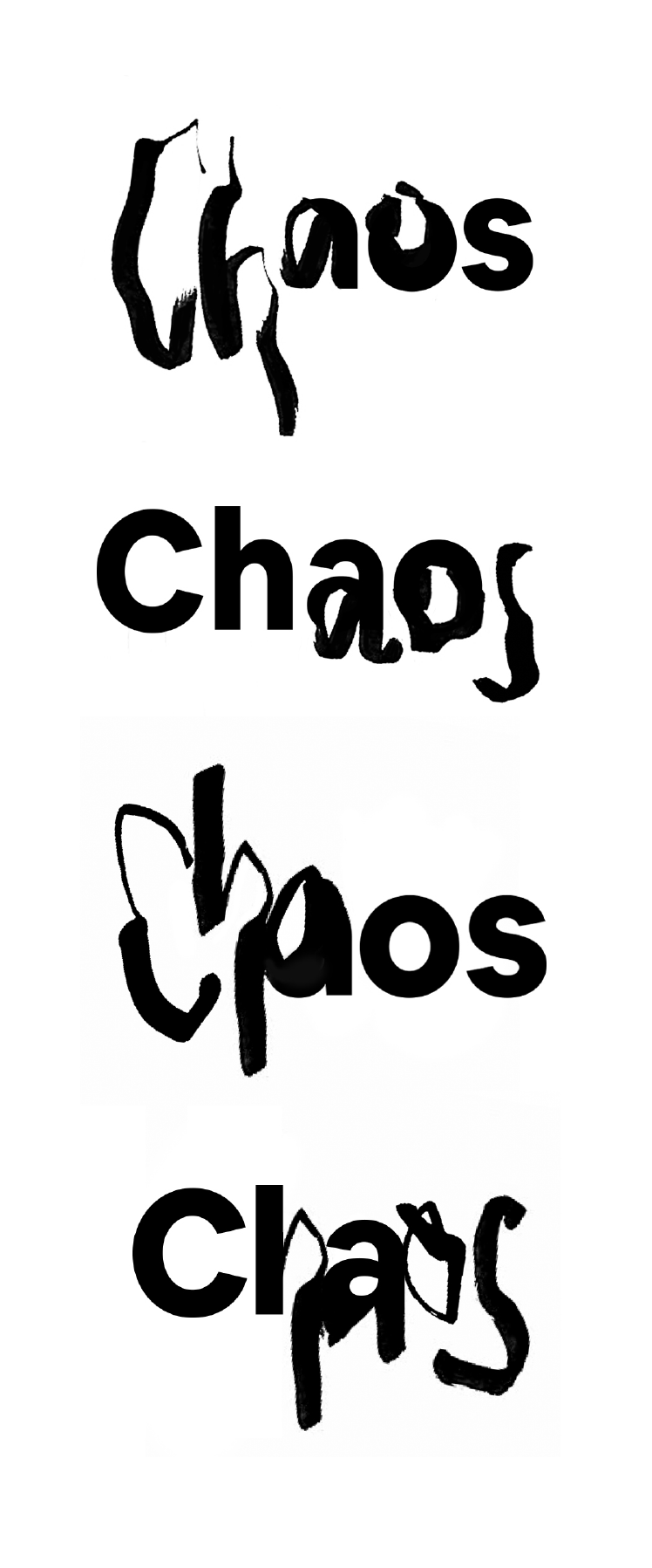
(Initial takes on my first Chaos concept)
It may oppose your every instinct, but some caution is necessary when that first enticing idea hits and you want to dive in fast and deep. If you don’t slow down, your frame of reference can be so flavored by the first concept that any other exploration can end up looking like the awkward cousin.
Of course everyone’s process is different, but there’s something to be said for the research and conversations that happen in the discovery phase—it just works. The temptation to quickly jump into a project blocks the opportunity to discern all the different stories you could tell—stories that are relevant and bring others into the process.
Don’t get me wrong, slowing down isn’t easy and I’m still teaching myself to do it. In theory, it’s easy to tell yourself to just slow down. But in practice it’s easier said than done, so I started to train myself with physical exercises. When I feel rushed or a flurry of ideas come on, but know I need to take a step back, I actually tell myself to slow my breathing. I take a walk. I do something to physically slow my body down, which allows my mind (and process) to follow suit.
At first, forcing myself to literally stop, drop, and slow my roll felt awkward. But I’ve found that the more I actively practice the physical manifestation of the mental space I want to be in, the more intuitive a slow, thoughtful approach has become part of my process.
Give It Meaning
When you recognize a design as aesthetically pleasing, your enjoyment of it can be that simple—it just looks nice. But I’d argue that a true connection takes place when there’s an intentional story woven into the art direction. What does it all mean? Whether the audience perceives the plot or not, that element of narrative intent has the ability to draw people in. And just like anything else, a good story takes time to develop.
I often find myself tasked with proposing various concepts in response to a single ask. How many compelling stories can I tell? For each concept, I write guiding principles—a manifesto and defining characteristics—in a place where I’ll be constantly reminded of them. I’ll pair each principle with an specific set of artboards when I’m working. By pairing these principles with each concept, I’m able to uphold each one’s integrity, create clear distinctions between them, and maintain the authenticity of each story.
And these stories don’t come from a silo. Unique stories that reach a broad audience require different points of view. I work alongside a Brand Strategist, an Editorial Producer, and a Creative Producer—all of whom leverage their strengths in partnership with me. We sharpen each other to deliver authentic, compelling narratives to our community.
Bring It To Life
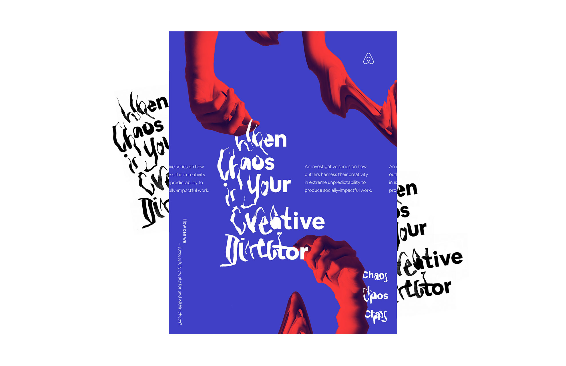
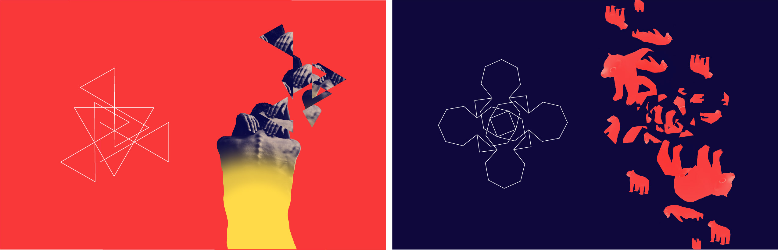
As our team dove deeper into the topic, we arrived at a new point of entry—Chaos Theory—which says that “within the apparent randomness of chaotic complex systems, there are underlying patterns.” Our series would feature people of varying professions—a hostage negotiator, an actor, a video game designer, and more—all of whom bring order to chaos in their respective fields. Our curation and an alternative definition of chaos started to tell the perfect story.
(Launch poster graphic for season two of Airbnb Design—Talks)
This time around, I designed every element of deliverables to tie back to that story—that underlying patterns only seemed chaotic. Where the first direction was random, the refined concept had order.
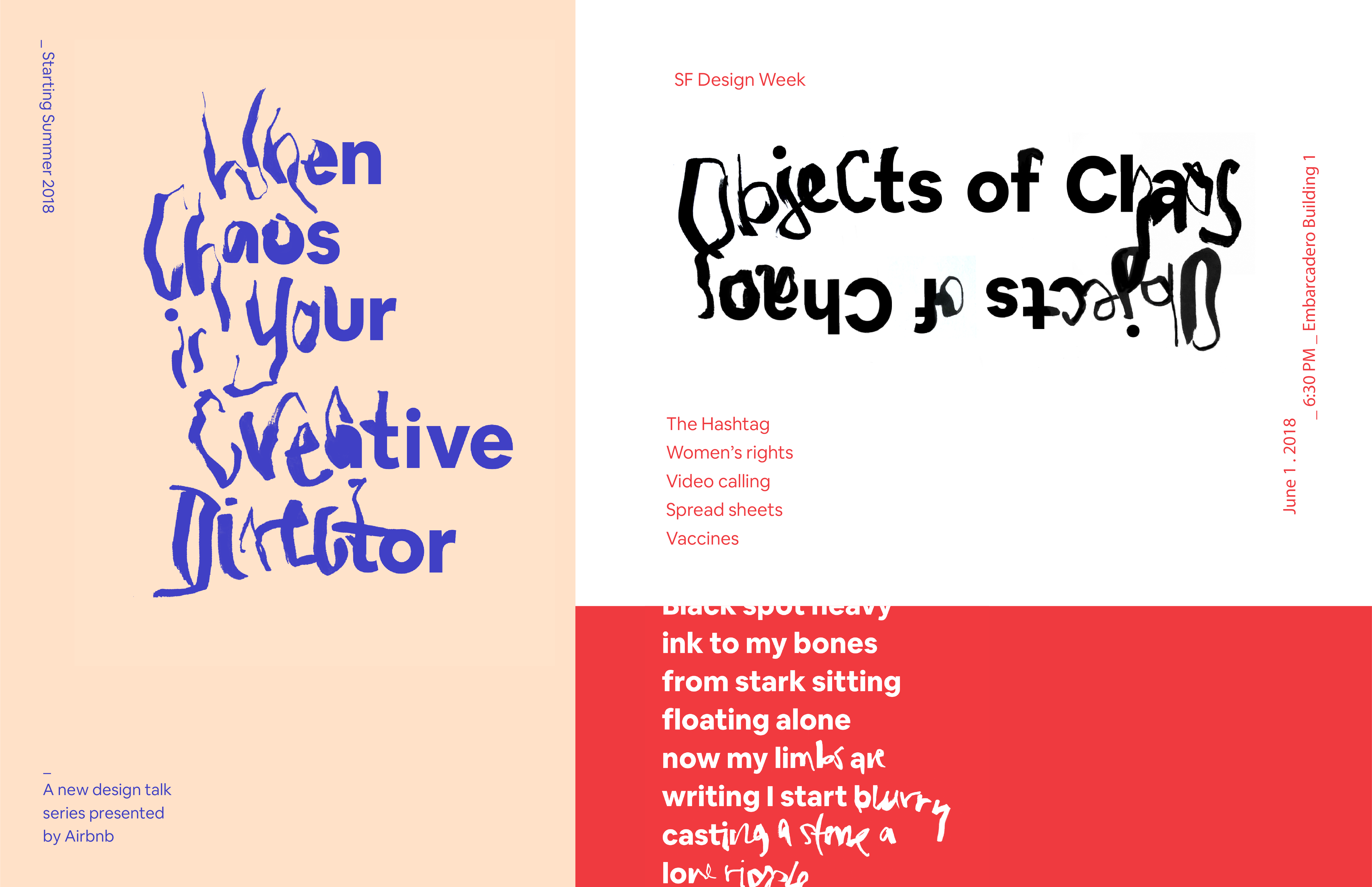
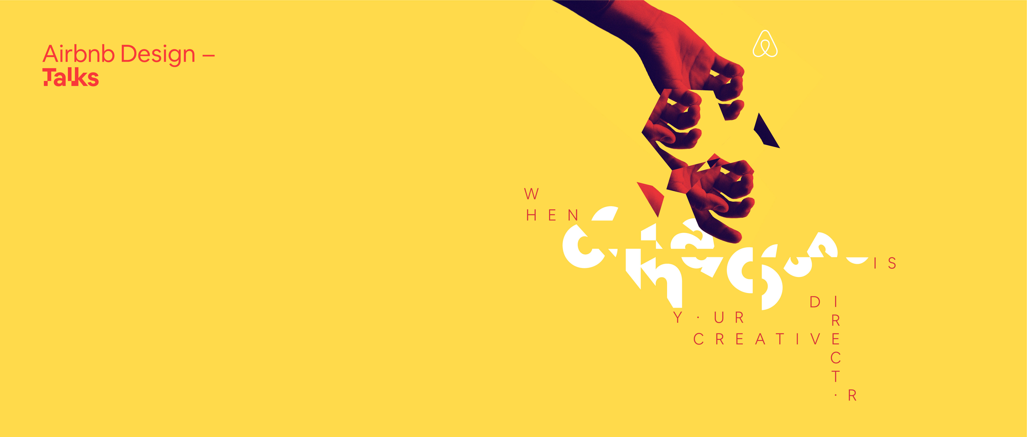
The color palette was a brightened version of Airbnb’s brand colors. Imagery, while broken up and distributed across the page, was set according to a library of geometric fractals (inspired by Chaos Theory found visually in nature).
We even took our recently launched, custom typeface—Airbnb Cereal—and distorted it. While the type was cut along a precise baseline, the very idea of deconstructing a precious project that took so long to craft was a risk. It was an invitation for us to embrace our own chaos and deepen the narrative.
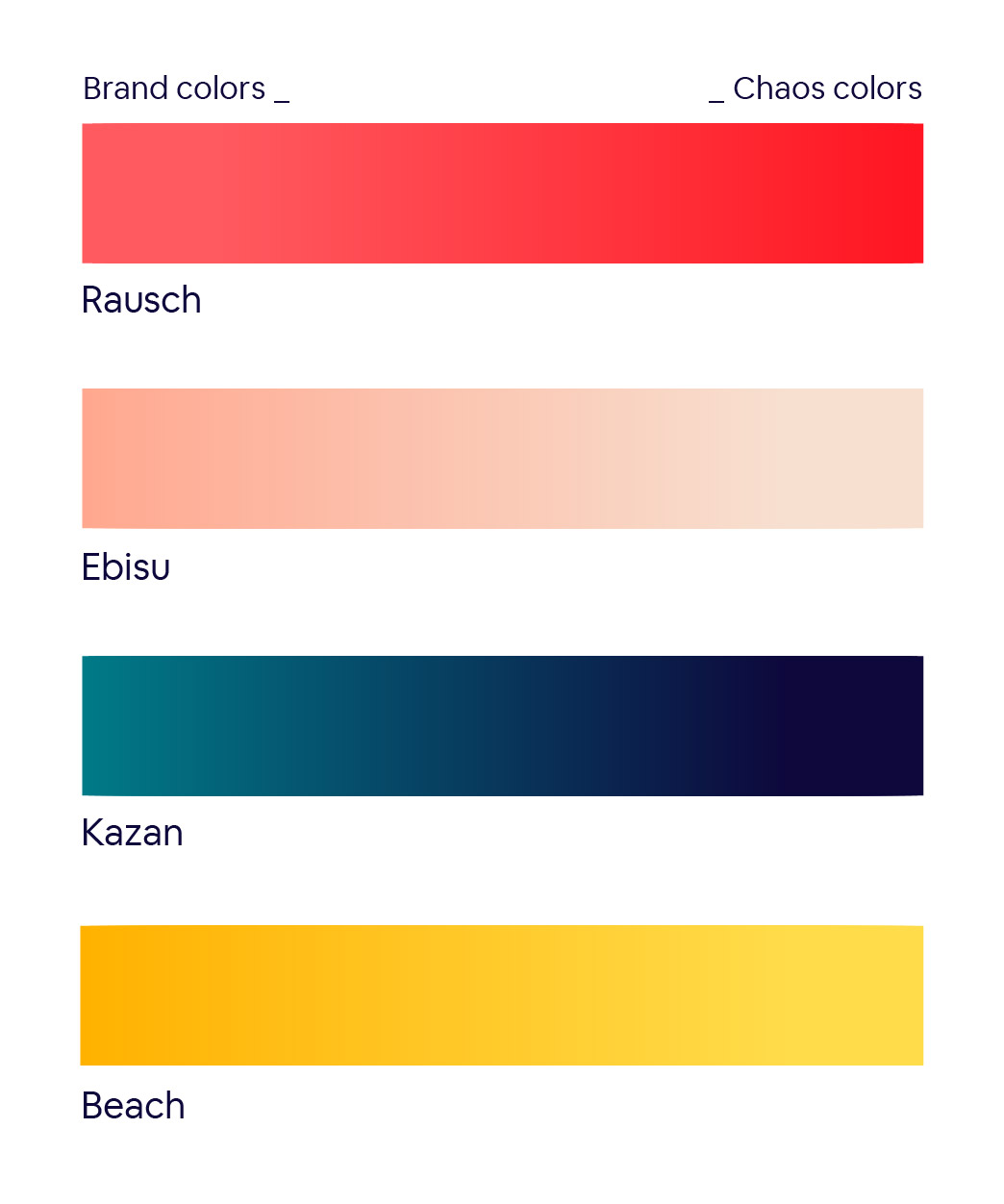
(The relationship between Airbnb’s brand colors and our Chaos colors)
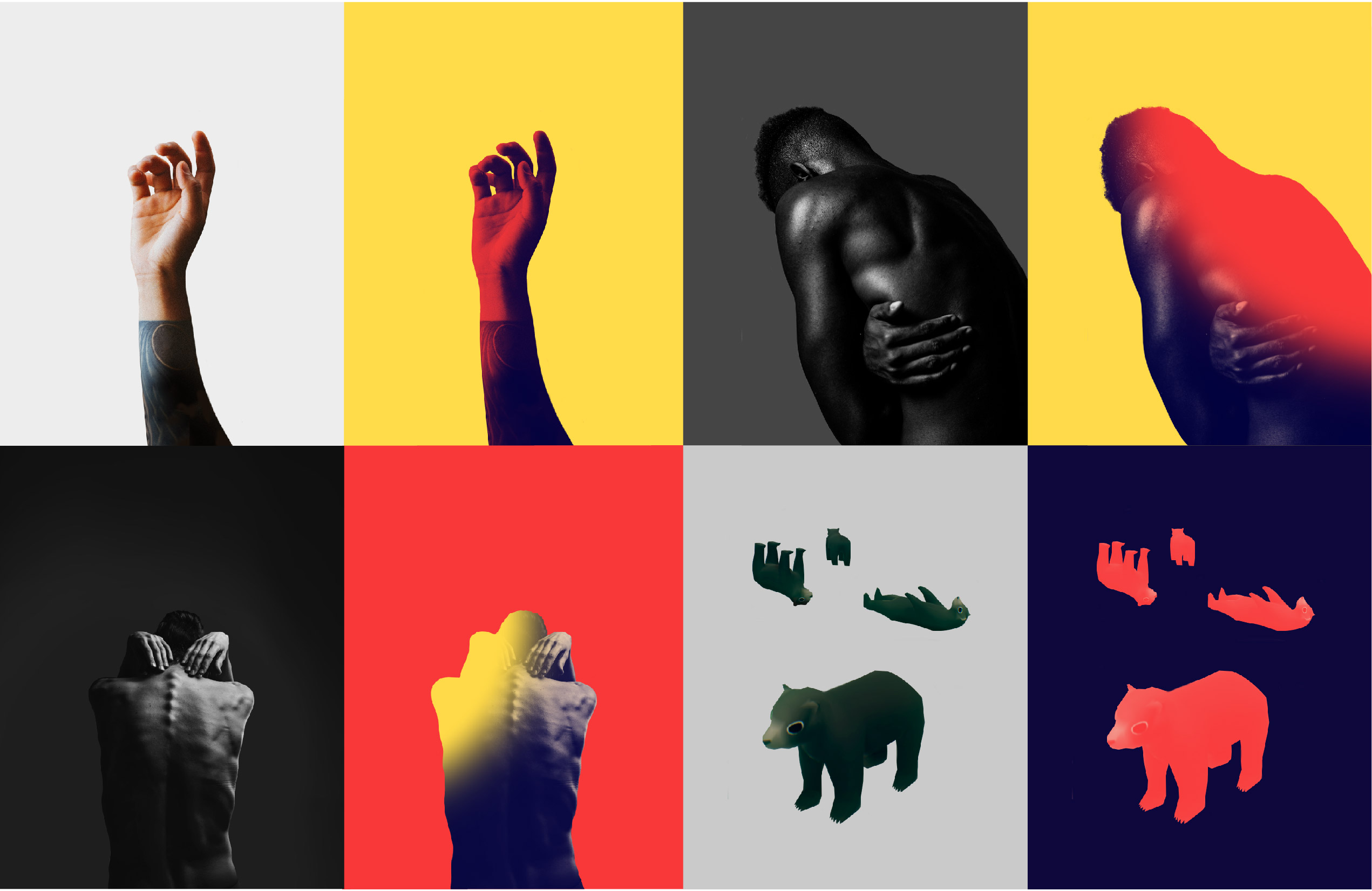
(Application of the color palette to imagery and photography)
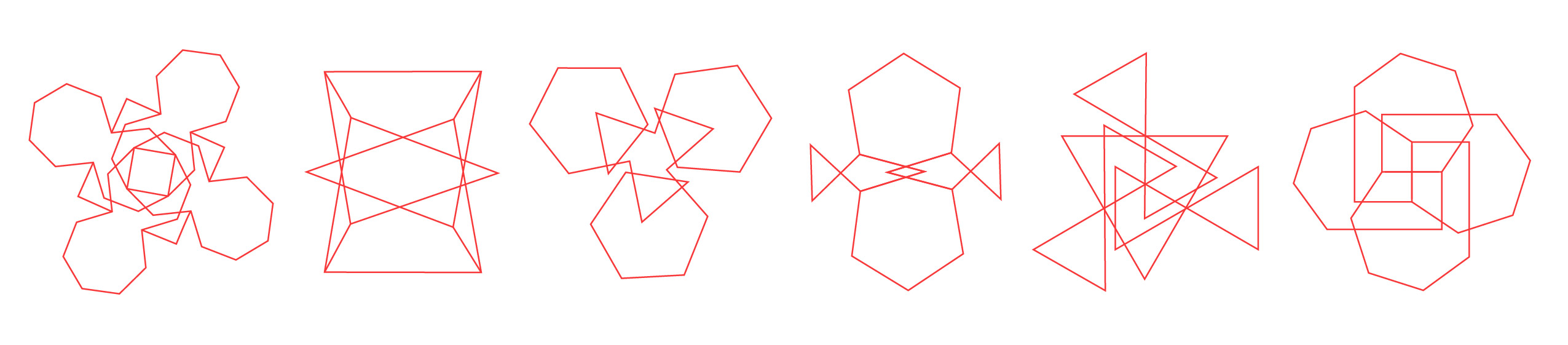 (Fractal shapes used to mask and distort imagery)
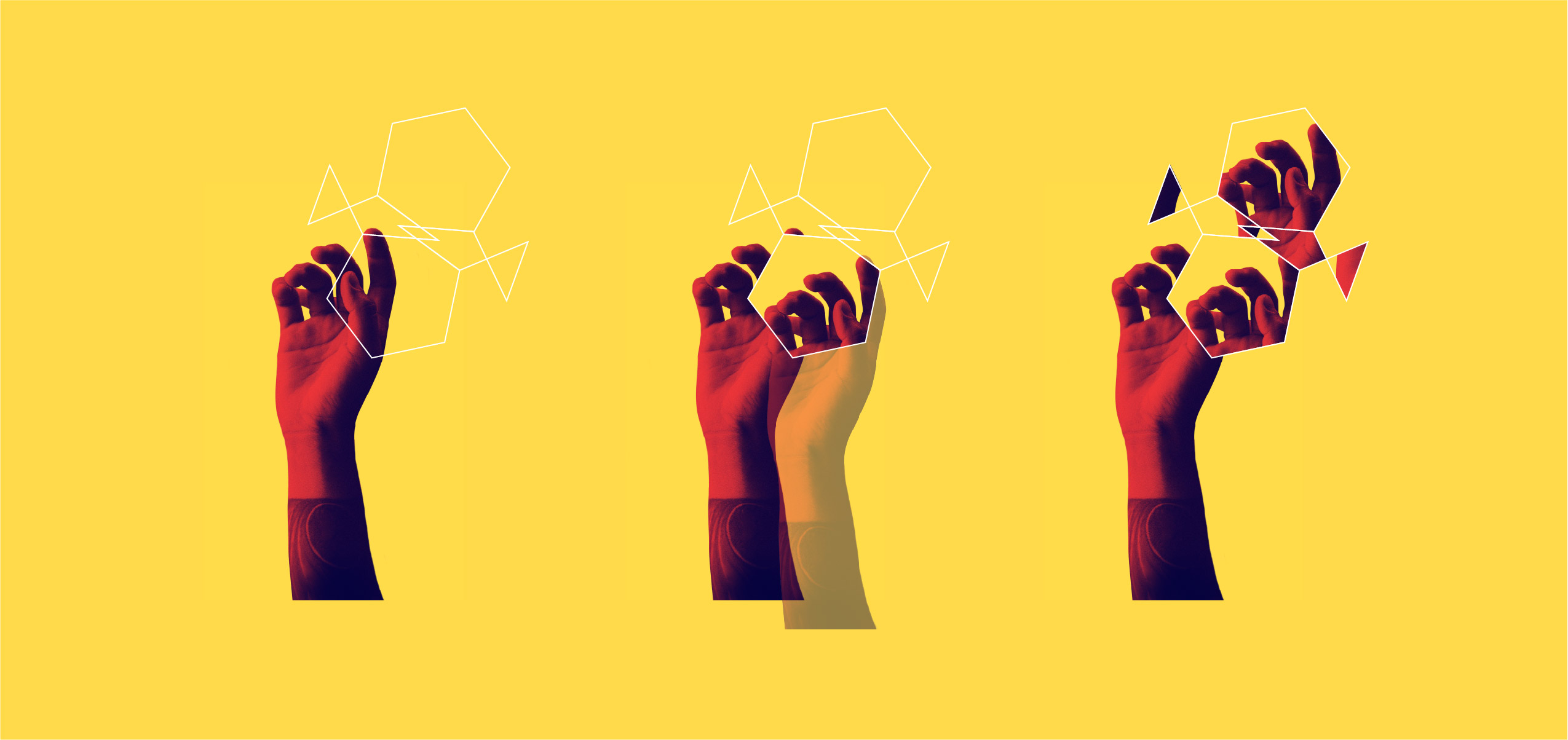
(Breakdown of the masking technique)
(Fractals and application masks)
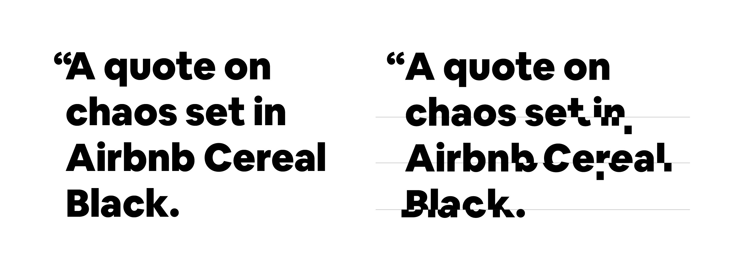
(The distortion system applied to Airbnb’s typeface, Airbnb Cereal)
While I preferred the look of my initial concept, our team decided on the Chaos Theory concept because it more deeply connected with the intent of the series. It’s a valuable lesson to remember: don’t pitch a concept just because you like how it looks. Instead, choose one that best connects with what you mean to communicate.
That fluorescent blue, gradient overlay might look neat, but if you have to work backwards to make it fit the brief, you should probably rethink it. Don’t let your personal preference convince you that it’s the best option, but definitely keep it as an experimental piece.
Make Them Feel
None of this is to say that your first idea won’t be the winning concept. Rather, this is all about intention. There’s a huge difference between just going with your first idea versus being confident in your initial instinct. One approach settles with the least amount of effort, while the other acknowledges the value of an idea while staying curious and remaining open to other explorations. When multiple avenues are thoughtfully investigated, your confidence and conviction is justified.
Authentic work comes from slowing down and developing stories that back it up. By considering our desired outcome from the beginning—like how we want people to feel or what we hope they’ll learn—we can intentionally design everything to connect back to our goals.
If you’re creating something for yourself, by all means, make it look cool just because. Do it for your own enjoyment. Design quick and messy. But if you’re designing for someone else, give them your best. Slow your roll, give it meaning, bring it to life, and make them feel.