Modern Pictograms for Lottie
Our collaboration with the The Noun Project on open-source animated icons
The Noun Project and Airbnb Design have collaborated to bring “Modern Pictograms” by John Caserta to life. Modern Pictograms is a set of icons animated specifically for Lottie, made to inspire designers around the world to create artwork for animation on native platforms. Download the animations and source files here.
Creating animation friendly artwork
The headline on The Noun Project’s website reads, “Icons for everything.” But as an animator and motion designer, I read the headline: “Animated icons for everything,” because whatever I download, I know I’m going to eventually make it move. And so we at Airbnb Design were thrilled at the opportunity to collaborate with The Noun Project and John Caserta to create this fun set of icons animated specifically for Lottie, our open-source animation tool.
Designing icons is an art. That’s why, throughout this article, you will see me using the word “artwork” instead of icon. The way in which any artwork is built depends on the personal preference of the artist. But while animating the amazing artwork made by John Caserta, we learned a few lessons that could help designers make pieces specifically for animation, or, shall we say, “animation friendly.”
Parts and pieces
There are a million different ways to make artwork. Fills, strokes, outlines, merged shapes — there’s no one way to do assemble the pieces. For an animator, though, it’s best to have as many elements broken out into layers as possible. Not only does it make things easier from a technical standpoint, artwork that is designed with a handful of separate parts is undoubtedly the most fun to animate.
For example, the projector screen on the left has three, distinct parts and allowed for some fun pauses and separation of elements. Even when I approached artwork that didn’t have parts intrinsically built in, such as the house on the right, I ended up breaking them up myself to create separation. Whenever there are multiple pieces you can add overlap and follow-through that really give extra dimension, weight, and personality.
Before and after
Some artwork animates on from nothing, and then animates back off into nothing. And that’s perfectly fine. But there are times when certain icons need to have a “before and after,” or an “on and off.” It is helpful to think of certain icons as sets that compliment each other, which may allow you to align things in a certain way since you know they are going to and from each other.
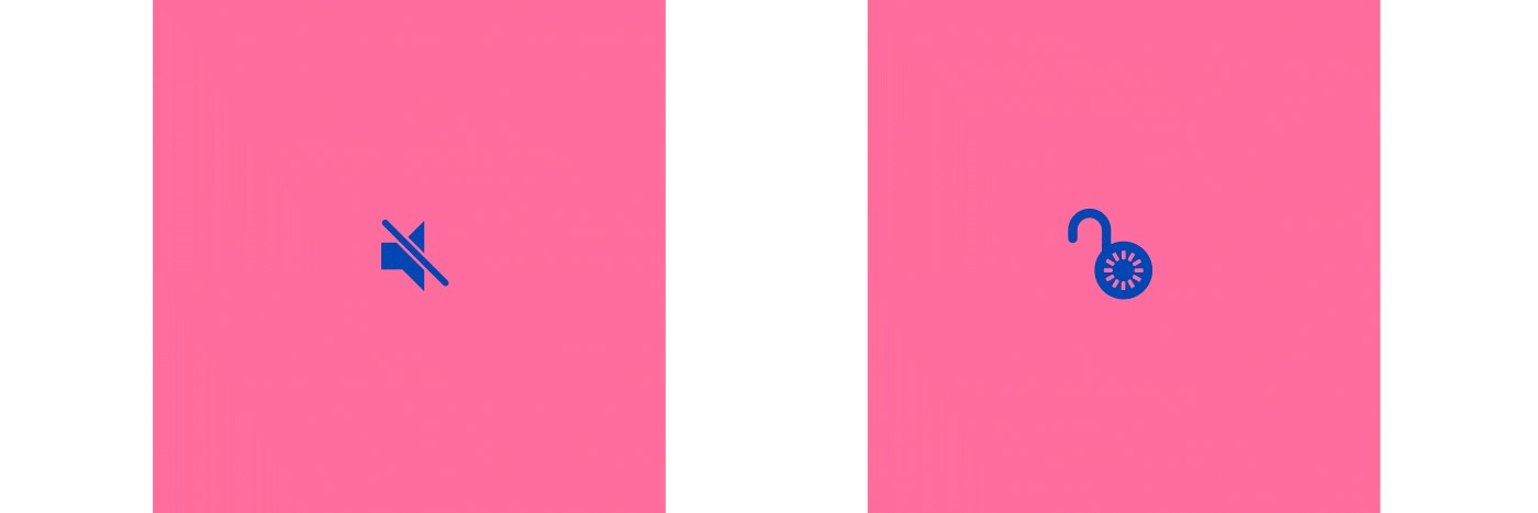
This Alarm, for example, has an on and off. As you can see, the alarm itself has to shift left and right to keep things centered. The lock also has two states, but instead of shifting to keep things center, the hook hangs off to the side when it’s unlocked.
In-betweens
In traditional animation, “in-betweens” are the drawings between key poses that get filled in to create the illusion of smooth motion. I’m using the term to talk about when artwork that animates to one thing, and then animates again to its final state. I think this technique is really powerful, and can add a lot of character and personality. It’s almost as though you’re creating a tiny little narrative within a few short moments of the animation.
In the pencil and paper above, we see the pencil draw a line, pause, and then animate into its final place. Similarly, the magnifying glass animation — which finds a small dot, shows it enlarged, and then spins into place — adds just a small bit of character to the animation.
Collaboration and community
While animating John’s artwork, I learned a lot about what makes a good icon, and John learned about how his artwork can be interpreted by an animator. Learning occurred on both sides of the table, and that’s just one of the reasons we’re so interested in collaboration between different disciplines at Airbnb Design. We aim to bring overlapping communities and practices together whenever we can, which is why we decided to bring together the Noun Project’s community with the growing Lottie community of animators and engineers.

We’re releasing these animations to the public for two main reasons. One is to support the community through open source projects and information sharing, which will spur other collaborations and open up a lot more creative possibilities. The second is to encourage designers like John Caserta, whether they are a part of The Noun Project or not, to think about animation and what it means to intentionally create something that will move. We hope you will download the source files, dig into them, analyze them, change them to your heart’s desire, and release them back out into the public for everyone’s benefit.