Building a Visual Language
Behind the scenes of our new design system
This article is part of a series on our new Design Language System. Karri recently answered questions about this topic in a Designer News “Ask Me Anything” interview. Click here to read the transcript.
Working in software development and design, we are often required to ship one-off solutions. Sometimes we’re working within time constraints and sometimes we just haven’t yet agreed upon a path forward. These one-off solutions aren’t inherently bad, but if they aren’t built upon a solid foundation, we eventually find ourselves having to pay back accrued technical and design debts.
Visual language is like any other language. Misunderstandings arise if the language is not shared and understood by everyone using it. As a product or team grows, the challenges within these modalities compound.
Design has always been largely about systems, and how to create products in a scalable and repeatable way. From Pantone colors to Philips screws, these systems enable us to manage the chaos and create better products. Digital products are perhaps the most fertile ground for implementing these systems and yet it’s not often considered a priority.
A unified design system is essential to building better and faster; better because a cohesive experience is more easily understood by our users, and faster because it gives us a common language to work with.
Why we need design systems
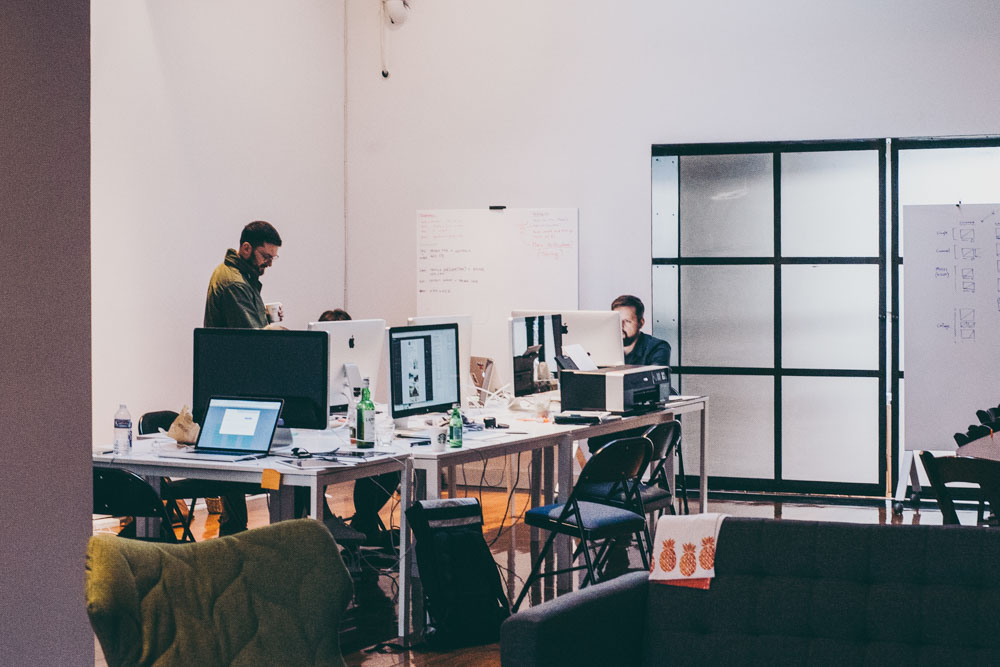
Airbnb has experienced a lot of growth over the years. Currently our design department consists of nearly a dozen functions and outcome teams. It became clear that we needed more systematic ways to guide and leverage our collective efforts. While we recognized these challenges within the company, I believe they are symptoms of larger software industry problems.
Too few constraints
Software design has few physical constraints compared to many other design disciplines. This allows for a variety of solutions to any given challenge, but also opens it to disjointed user experiences. As product owners and designers, we have to create and follow our own constraints.
Multiple designers and stakeholders
Software is often built by teams– sometimes incredibly large teams– of people. The challenge to create coherent experiences multiplies exponentially as more people are added to the mix. Also over time, no matter how consistent or small a team is, different people will contribute new solutions and styles, causing experiences to diverge.
Multitude of platforms
We need to ship our product on a multitude of platforms and devices. Keeping features and designs synchronized takes significant effort, often requiring the same work to be repeated across all of these platforms.
Software as a continuum
Another unique thing about software is that, while it can be considered a product, it doesn’t really wear out and get replaced like traditional consumer products. Code and designs created years ago still exist in many places, even after the landscape of a company and its product have shifted significantly. This requires constant maintenance and upgrading.
Getting to work
To work through these challenges and keep our decision making process fast, we assembled a small group of designers and engineers [2]. We cleared our calendars, reserved an external studio place just outside Airbnb HQ, and dedicated ourselves to designing and building the Design Language System (DLS).
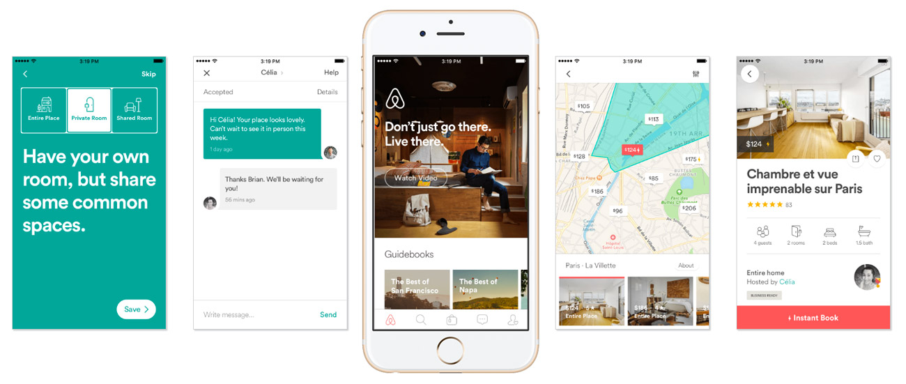
The goal we set for the DLS was to create a more beautiful and accessible design language. Our designs should be unified platforms that drive greater efficiency through well-defined and reusable components. In order to focus our efforts, we reduced the initial scope to creating the system first on native platforms (iOS & Android).
We started by auditing and printing out many of our designs, both old and new. Laying the flows side by side on a board, we could see where and how the experiences were breaking and where we needed to start making changes. We figured that the best way to begin was by tackling issues head on. Each of us focused on a screen or product area to redesign, And we established a few principles to guide us with these individual designs:
Unified: Each piece is part of a greater whole and should contribute positively to the system at scale. There should be no isolated features or outliers.
Universal: Airbnb is used around the world by a wide global community. Our products and visual language should be welcoming and accessible.
Iconic: We’re focused when it comes to both design and functionality. Our work should speak boldly and clearly to this focus.
Conversational: Our use of motion breathes life into our products, and allows us to communicate with users in easily understood ways.
Laying the foundation
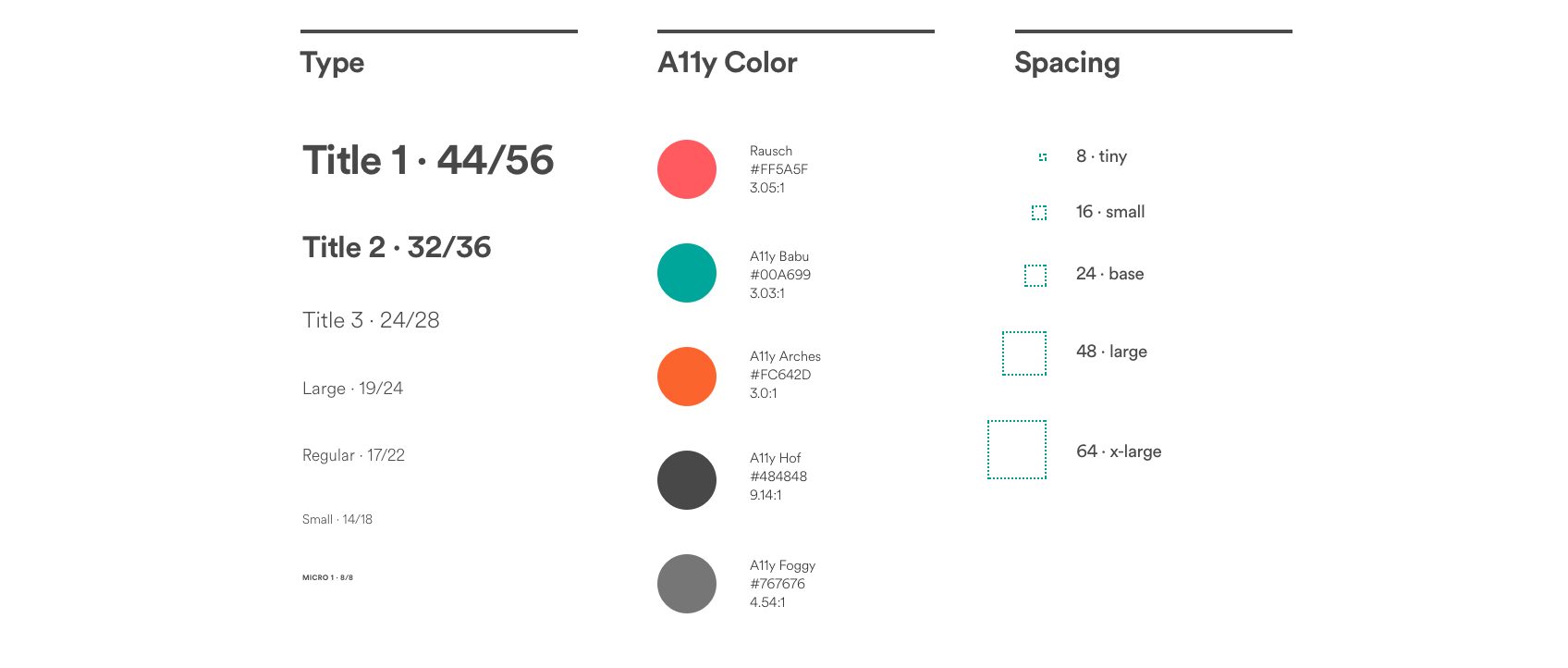
Prior to beginning this design sprint, we had already created a basic style guide, that we called the foundation. This foundation loosely defined our typography, colors, icons, spacing and information architecture. The foundation proved essential for guiding our work in a unified direction while allowing room for us to individually explore creative design solutions. This way we felt that we were all working together, towards the same idea. Reviewing our collective work at the end of each day, we began to see patterns emerge. We course-corrected when necessary, and started defining our standardized components.
Creating the Components
Traditionally, many style guides define components as atomic components, which are then used to build more complex molecules. In theory, this works well to create coherent and flexible systems. In practice, however, what often happens is that these re-usable atoms are used many different ways, allowing all kinds of molecules to be created. Again, this opens the door for all kinds of disjointed experiences and makes the system harder to maintain.
Instead of relying on individual atoms, we started considering our components as elements of a living organism. They have a function and personality, are defined by a set of properties, can co-exists with others and can evolve independently. A unified design language should not just be a set of static rules and individual atoms, but an evolving ecosystem.
A unified design language shouldn’t be just a set of static rules and individual atoms; it should be an evolving ecosystem.
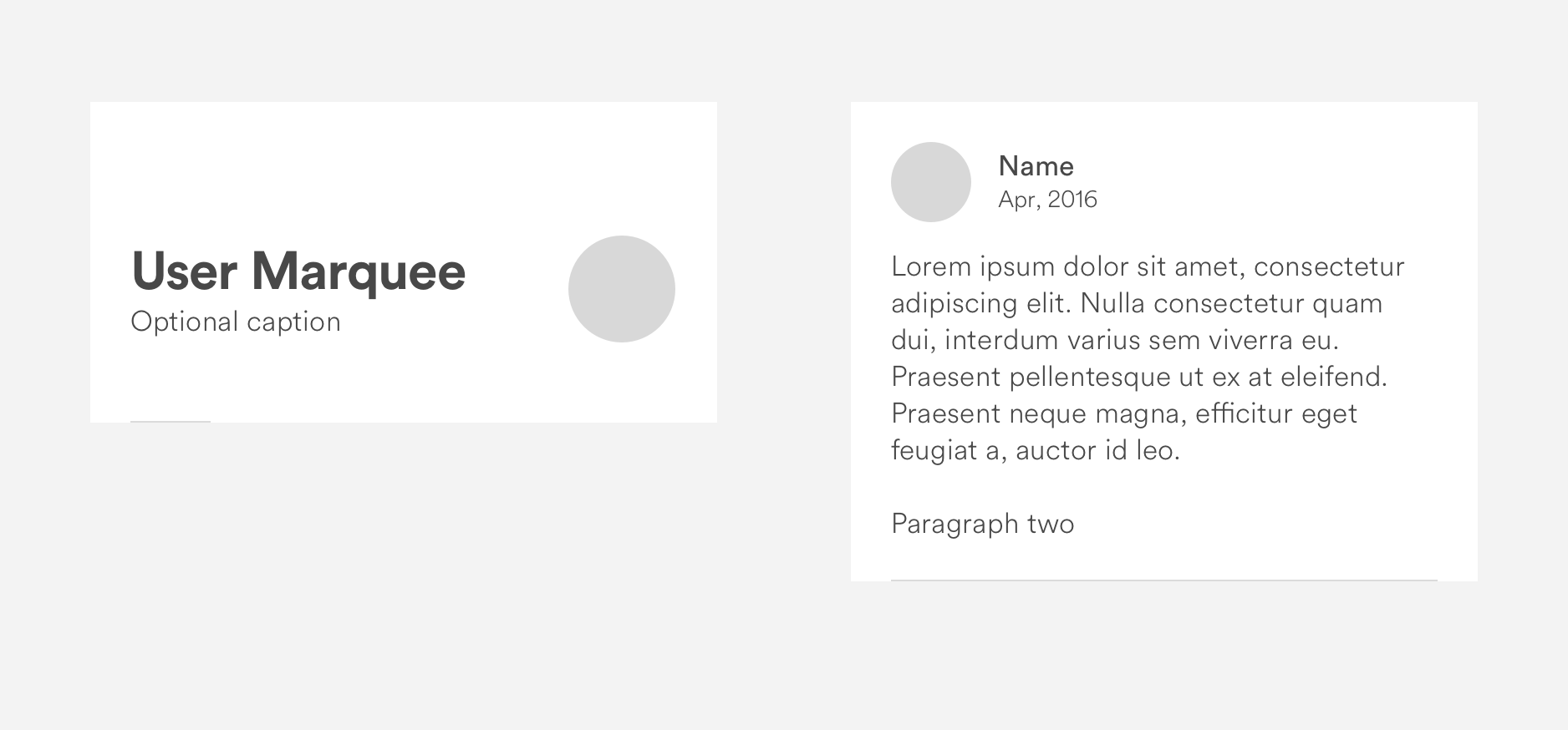
For example, our user avatar element might be initially defined by a style guide, but its end use in the platform can take on hundreds of permutations, making it difficult to successfully update the avatar element down the road.” If we want to change either of these things, we can be sure that we don’t break other screens.
Each component is defined by it’s required elements (such as title, text, icon and picture), and may sometimes contain optional elements. These elements are both defined in the Sketch document as well as in code. Instead of allowing divider lines themselves, we require each component to have a divider, which is then visible or hidden based on on the view logic.
Compiling the library
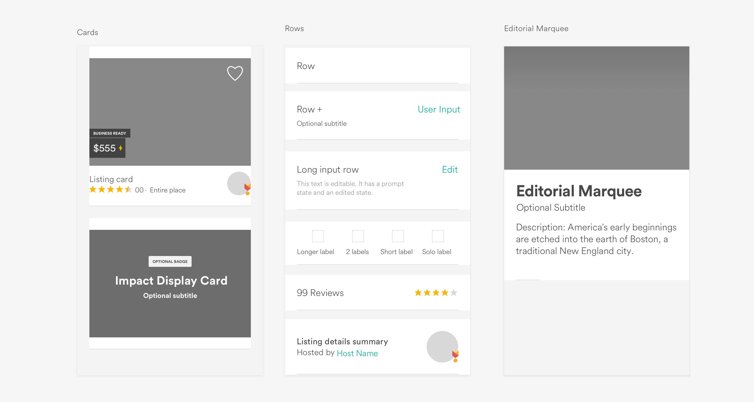
While creating these components, we collected them in a master file called the library, which we referred to throughout the design process. After a week or two we began to see huge leaps in productivity by using the library when iterating on designs. One day, while putting together a last-minute prototype, our team was able to create nearly 50 screens within just a few hours by using the framework our library provided.
While the library was growing, we started organizing individual components into artboards containing similar items. These artboards were then organized by general category into: Navigation, Marquees, Content, Image and Speciality.
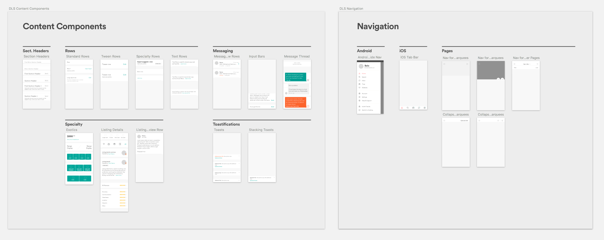
We created one set of these components for phones (iOS and Android), and adapted them to tablet sizes from there. Tablet components are largely the same as those for mobile, and on a technical level the code only needs to exist once in two different styles. With this system components can vary in their look and positioning, similarly to the way responsive design works for web. Designers can then design a screen once using common components, and it can be easily adapted to different screen sizes as well as to iOS and Android.
For tablet we created a couple of simple layout concepts, such as Focus Views, which focuses the content on the page, modals, and 2-column and grid layouts.

All of the components and views are built with our own technical view framework, which handles these styles, states and adaptivity. [2]
Lessons Learned
We knew that this was a challenging project. It meant re-designing and rebuilding the majority of the views in our app. We managed to make our goal of creating the system and releasing the new apps on April 17th. As with any project, there are things we wish we would have done differently.
Not all components are created equal. In most apps there are a set of components that repeat often. For us, these components are rows (or table-cells). Looking back, I wish we had taken more time to think about the rows and come up with a stronger set of patterns and components. In the end, we wound up with many different kinds with some inconsistencies.
Sketch. We initially tried to create these components as symbols in Sketch, which resulted in a mess. Even now, our Sketch files are sometimes challenging to maintain. Moving forward, we hope to find better ways of maintaining and creating new components. [3]
Documentation. This project required us to operate within a tight timeline, which caused us to overlook some of the documentation process. Lacking thorough documentation created some confusion that could have been avoided. Just like with coding, documenting systems as they are created is paramount to the process. It has to be done sooner or later, and documenting throughout the creation process allows for smoother decision-making.
Conclusion
While this was a monumental task that ended up requiring efforts from many of our product teams, we found that creating our Design Language System was worth the investment and a huge leap forward.
Since the design language and code are often shared, we can now build and release features on all native platforms at roughly the same time. Development is generally faster, since product engineers can focus more on writing the feature logic rather than the view code. Additionally, engineers and designers now share a common language.
Designers were also excited about the system. It enables product reviews to focus on the actual concepts and experiences of a design, rather than padding, colors and type choices. The DLS provides us with a shared understanding of our visual style, and streamlines contributions to a single system. This system also enables all of us to prototype and experiment with ideas in high fidelity faster and at a lower cost.
I believe that aided with these systems we can focus more on actual user experiences and concepts we want to create in the future.
Talks around DLS (Updated June 2018):
SF Design Week · June, 2018
Karri Saarinen: Systematic Cross-Platform Design
Design System Conference · March, 2018
Karri Saarinen: When We Use Systems
Nordic.design · September 2017
Karri Saarinen: Scaling Design with Systems
Footnotes:
[1]: Many great projects are about teams and there are always too many people to thank for but I wanted to highlight few people who made this project happen:
Bek Stone, Adam Michela, Amber Cartwright, Alex Schleifer, Michael Bachand, Paul Kompfner, Sean Abraham, Salih Abdul-Karim, Michael Sui + many others in the design and engineering teams. Thanks Josh Leong, Sola Biu, Catherine Waite for reading the drafts of this.
[2]: I’ll leave it to one of our engineers to write more about the technical side the DLS.
[3]: In our case, we want people to be able to change the symbol sizes (eg. you need to fit in more content in to a header). If you need to resize or accidentally resize something, Sketch (<3.5) would automatically resize every instance of that symbol. That would kill your sketch for few moments and probably mess up your file permanently (sometimes undo didn’t work). We ended up putting the components in Layer Groups, and letting people copy and paste them.
We also use git/github to facilitate the file updating process. We manually create and add new components to our master library Sketch file, and submit pull requests with a change log and generated png exports that document the changes. After that, the Sketch file ends up in to a shared Box folder, which is linked to Sketch templates, so everyone has access to the new components immediately.